Redesigning Digital Onboarding
Project overview
Digital Onboarding is a platform for clients to open accounts online without the need to visit a branch. In an internal UX audit, we found that about 60% of clients started their applications on mobile devices even though the platform wasn't optimized for mobile.

Consequently, I proposed a conceptual redesign of the digital account opening process with the following goals in mind:
  • Offer practical solutions to existing drop-off points in the existing experience.
  • Convey the benefits of a mobile-first approach and outline how this could improve conversion.
My role
Lead Product Designer
Challenge
Identify mobile shortfalls in the existing flow and create a mobile-first concept that optimizes the user experience while staying within the limitations of existing technology.
The current experience
Thanks to ongoing collection of user feedback, my team and I could identify some of the main pain points in the present experience. They included:
  • Tedious forms and methods of information gathering.
  • Unclear instructions and lack of progress indication.
  • Confusing page structures, leading to stalled progression.
Jobs to be done
Investigate best practices

I conducted a market and competitor analysis to gain insight into onboarding best practices.

Draft user flows

My team and I created user flows helped support early discussions with stakeholders and was a quick way to explain proposed optimizations.

Mockup creation

High fidelity mockups were a useful storytelling tool and helped stakeholders provide feedback on the process.

Backlog creation

Many areas of improvement were identified from this process, and along with the Product Owner, we were able to add important enhancements to the product backlog.
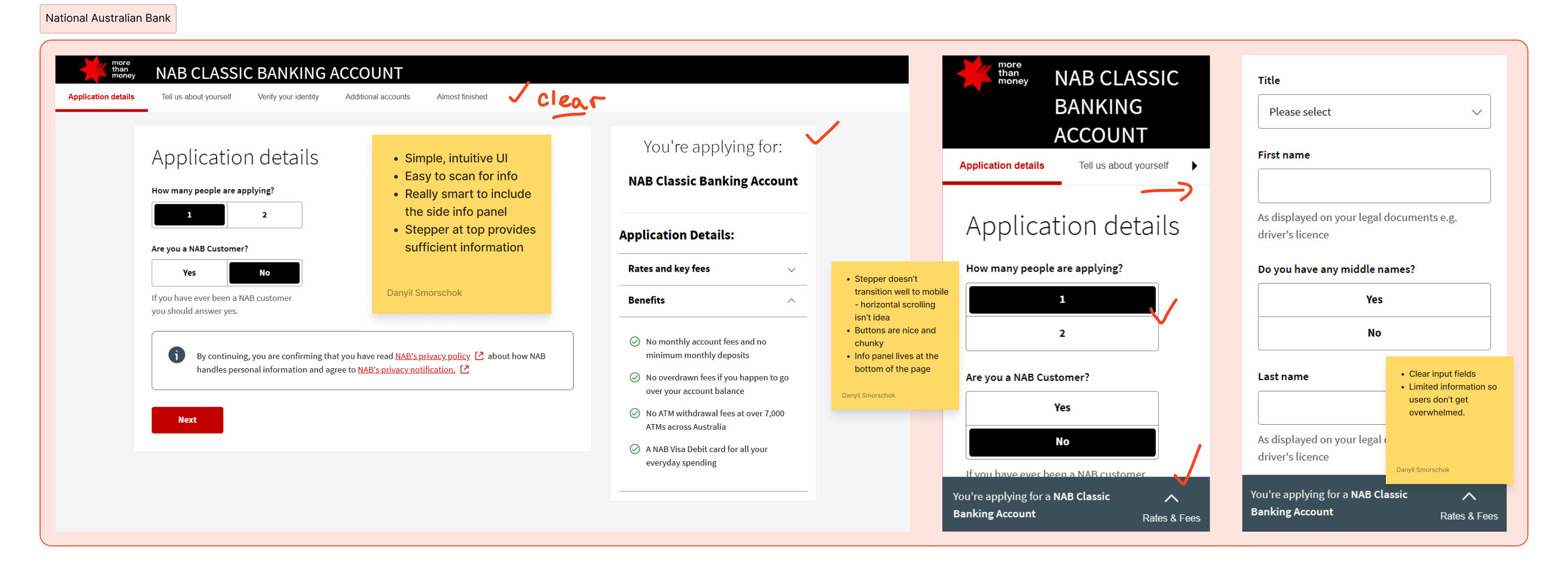
An image of NAB's digital onboarding flow. Takeaways included:
- Simple, clear UI,
- Large input fields,
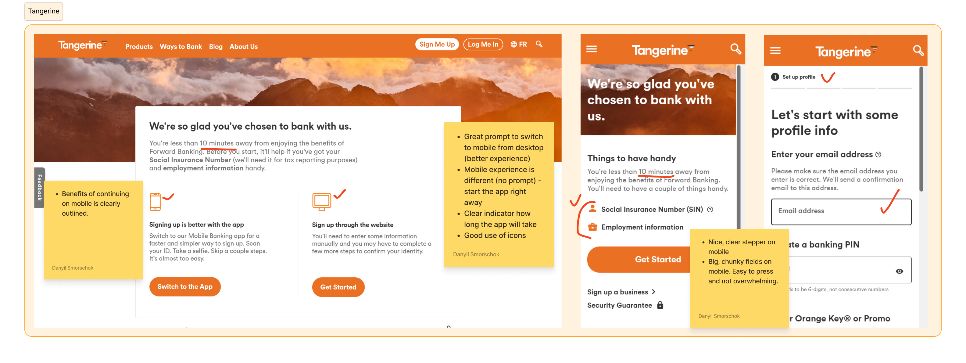
- Account information can always be pulled up. An image of a few Onboarding screens from Tangerine. Takeaways included
- A clear, informative stepper,
- Large, easy to press fields on mobile,
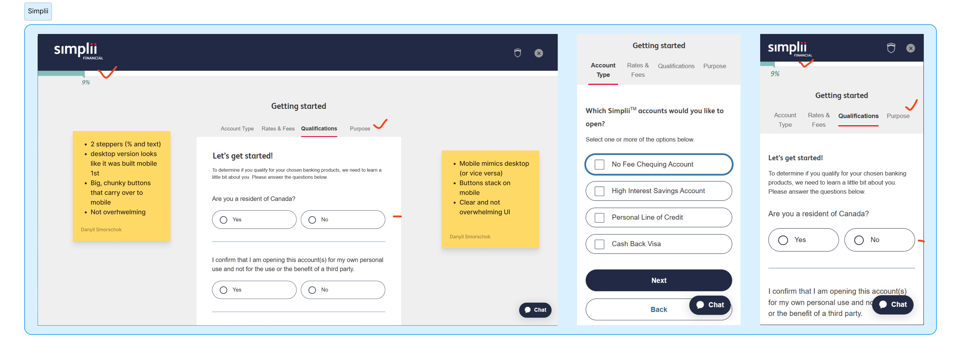
- Limited amount of copy.A few images of Simplii Financial's onboarding screens. Takeaways included:
- Limited number of fields/page to reduce cognitive overload,
- Clear stepper (visual and text),
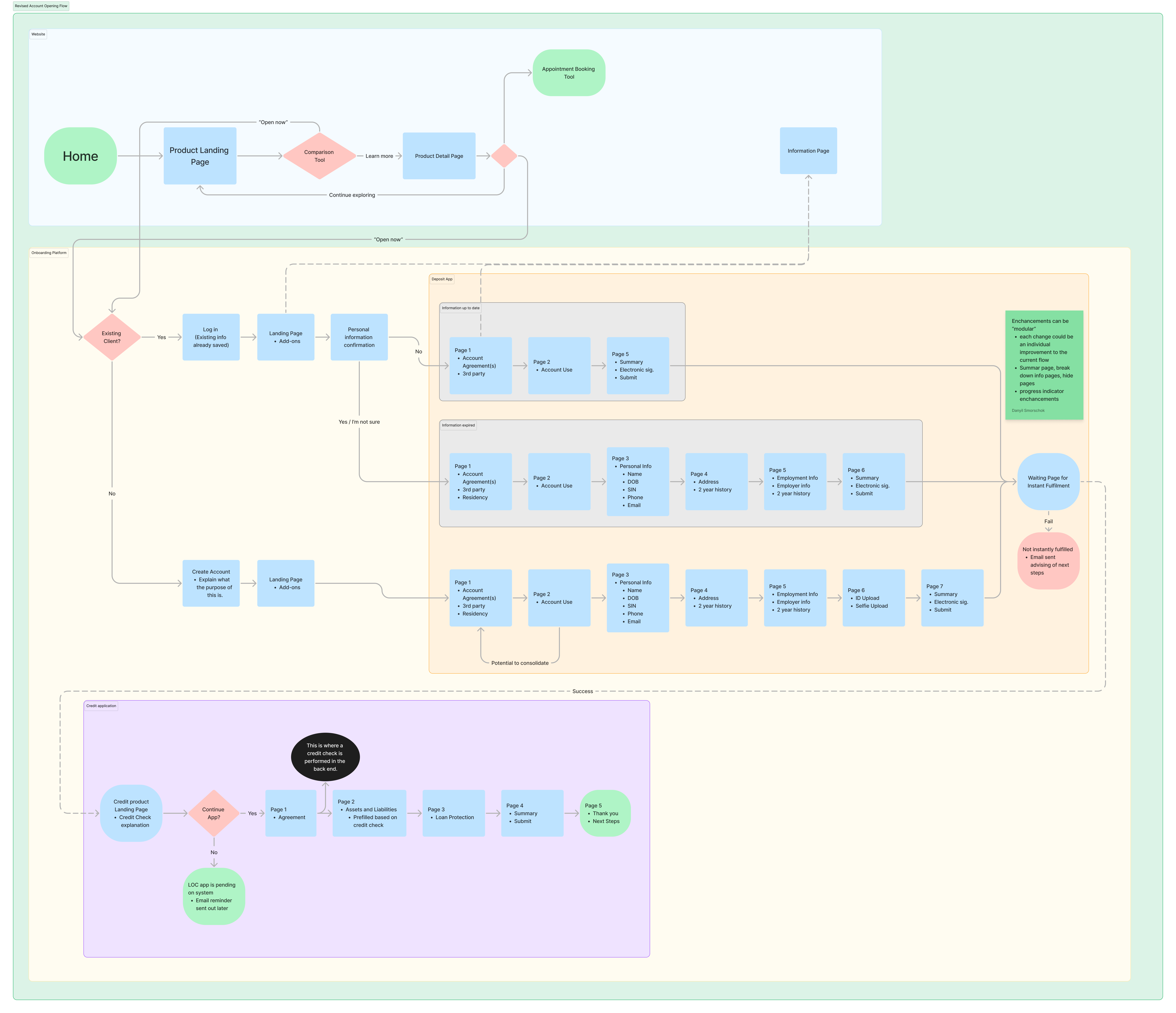
- Chunky, easy to press buttons.A screenshot of the proposed Digital Onboarding flow.
Optimized for mobile
Some of the enhancements that were taken into the backlog included:
  • A clear and accessible stepper:  This improved the clients ability to go through the application and provided clarity about the process.
  • An enhanced terms & conditions page: Clients were dropping off at this step as it wasn't clear that they needed to download the terms. The enhancement made this step much clearer and simpler.
  • General UI enhancements: To improve overall mobile usability, button stacking, replacing certain dropdowns with radio buttons, and implementing quick select buttons were all added to the backlog as well.
Lessons learned
The aim of this project was to create a shareable concept rather than a definitive design for implementation. Given the extensive scope of redesigning online account openings, collaboration with various stakeholders outside our team's usual scope was necessary, which goes to highlight how important effective communication is for designers.

To ensure success, it was crucial for my team and I to highlight the current shortcomings without assigning blame, and present enhancements as opportunities for global competitiveness. Clear communication of these benefits to key leaders played a vital role in the concept's success.
Designing Financial Calculators
Strategy | Product Design | Journey Mapping | Work Project
View project
Product Comparison Tool
UX Process | Prototyping | Research & Testing | Work Project
View project