Designing Financial Calculators
Project overview
ATB’s calculator project aimed to create a comprehensive suite of over 14 financial tools for client and advisor use. At the start, ATB lacked prominent client-facing calculators, causing advisors to rely on competitor tools. The primary goals of the project included:
  • Creating comprehensive tools to support advisor-client interactions.
  • Providing clients with self-serve opportunities that would help them make informed financial decisions while also offering financial education.
  • Improving the mobile calculator experience for clients on the go.
My role
Lead product designer
Challenge
Design 14+ financial calculators and update applicable client journeys to improve discoverability and conversions.
Live calculator
You can now view the live Mortgage Affordability Calculator
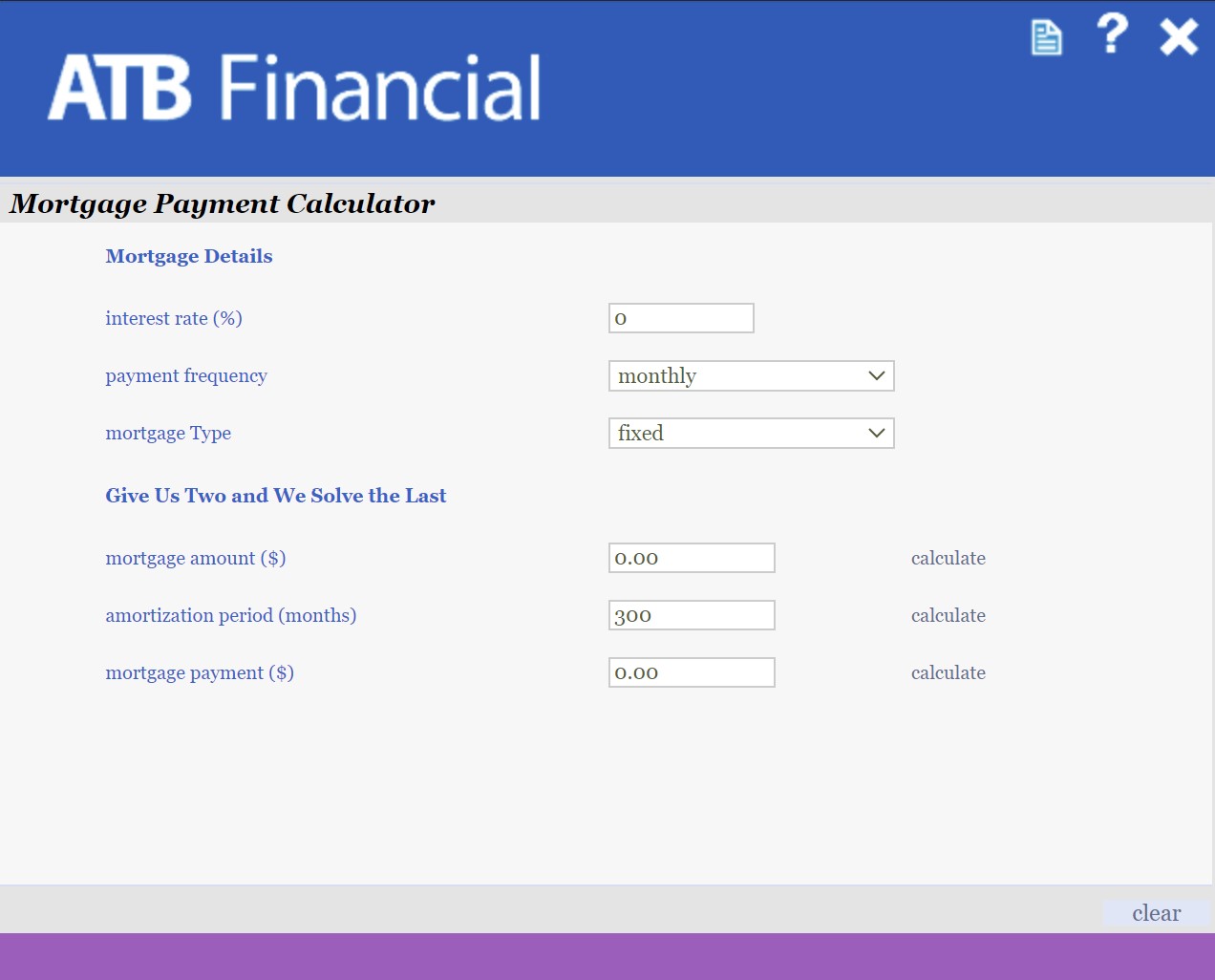
What we were replacing
The old calculators had numerous issues, including but not limited to:
  • Non-responsive layouts and a broken mobile experience.
  • Poor accessibility, failing to meet the updated W3C guidelines .
  • Outdated UI, decreasing trust with clients.
Planning and stragety
As the design lead, I played an active role in planning timelines, committing to deliverables, and maintaining clear communication between product owners, developers, stakeholders, and the design team.

Some of my key achievements included:
  • Improving cross-team communication by creating weekly design/dev syncs for ongoing work showcases, bug solutions, and Q&A.
  • Establishing a regular “check-in” process to ease stakeholder anxiety about timelines and deliverables.
  • Collaborating with Product Owners and developers to create a concrete design handoff process.
  • Taking ownership of user journeys, and suggesting optimal calculator placement to stakeholder groups.
Unique challenges
As the project started, I identified two major challenges that had potential to slow down development and disrupt delivery timelines:
  1. Creating 14 unique calculators would demand significant dev and design work, causing stakeholder anxiety about timelines.
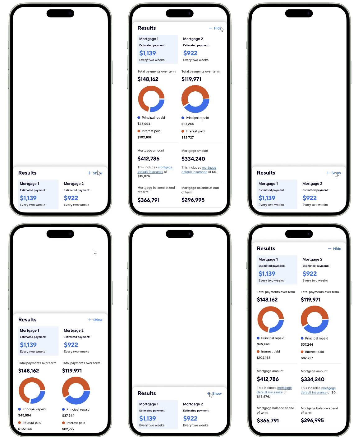
  2. Scroll depth was an existing issue on atb.com, especially on mobile devices. If the results were too far down the page, these was a risk clients wouldn’t scroll down enough to see them.
To address these, my team and I implemented the following solutions:
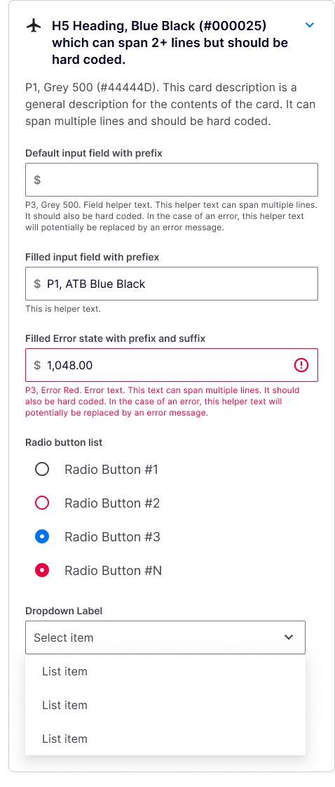
  • Design templates: We created a set of universal templates to accommodate various business requirements, speeding up design and reducing dev effort.
  • Bottom sheets: We proposed using a “bottom sheet” component to display results on mobile devices, ensuring easy access regardless of page depth.
The design process
Insight gathering
For each calculator we made sure we were prepared by gathering market research and conducting competitive analyses.
Design and test
After compiling our insights, we would create and test initial designs, iterating based on user and stakeholder feedback.
Handoff and beyond
Thanks to the streamlined design handoff process I established, we were able to efficiently share and verify designs with the development team.
Lessons and achievements
Some of the key takeaways I have from leading design on this project include:
  • Clear communication is a must:  Regular check-ins helped alleviate concerns about deliveries, turning stakeholders into allies.
  • Template design were a success: By utilizing the  templates I created, both design and development was sped up tremendously.
  • Bottom sheets were a hit: This solution for displaying calculator results on mobile devices tested well. Benefits included reducing scroll depth and minimizing back-and-forth scrolling, which was a delight for users.
The live experience
You can experience the Mortgage Affordability calculator by clicking on the following mockup:
Digital Onboarding Redesign
UX Process | Strategy | Business Alignment | Work Project
View project
Product Comparison Tool
UX Process | Prototyping | Research & Testing | Work Project
View project