Creating a Product Comparison Tool
Project overview
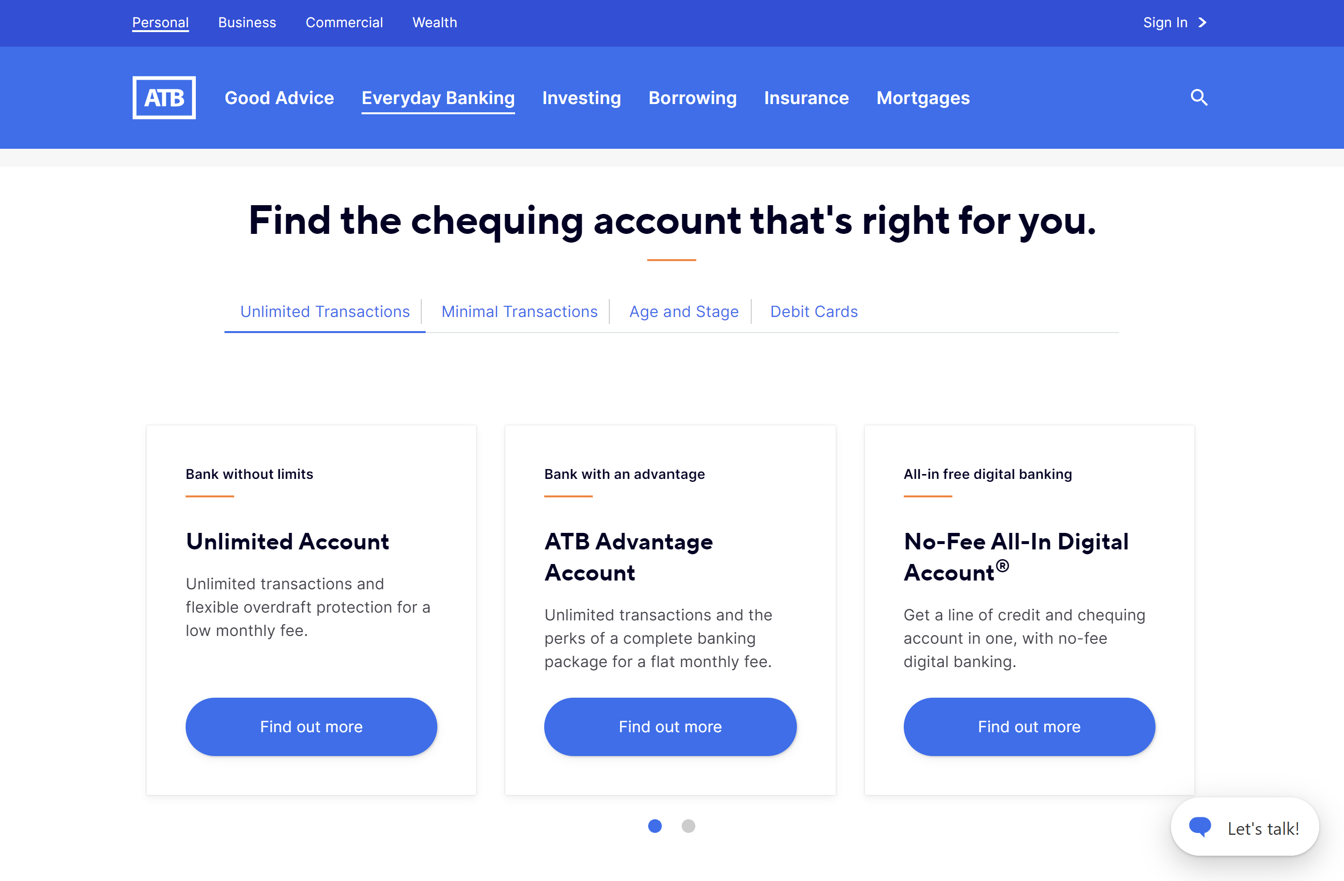
As part of a website audit, a significant gap was identified in ATB's sales funnel due to the absence of a product comparison tool. This shortfall prevented clients from comparing different banking accounts and impacted decision making. In response I was tasked with designing the tool.

The benefits of introducing a comparison tool included:
  • Enabling clients to make informed banking decisions.
  • Allowing business units to address client needs and offer relevant information based on user feedback and metrics.
  • Improve the conversion funnel by featuring more prominent calls-to-action (CTAs) earlier in the discovery flow.
My role
Lead Product Designer
Challenge
Design, test, and implement a product comparison tool that would allow clients to quickly compare similar banking accounts and improve the top-of-funnel experience.
What we were replacing
The current state of the web pages at the time had several opportunities for optimization, including :
  • Showcasing concise feature benefits to improve comparison amongst similar product offerings.
  • Surfacing conversion CTAs earlier in the client journey. To streamline the top of the sales funnel.
  • Improving layouts to allow for a more comprehensive comparison experience (and reduce scrolling/swiping).
Jobs to be done
Uncovering best practices

I conducted a market analysis to gain insight into comparison tool best practices.

Drafting user flows

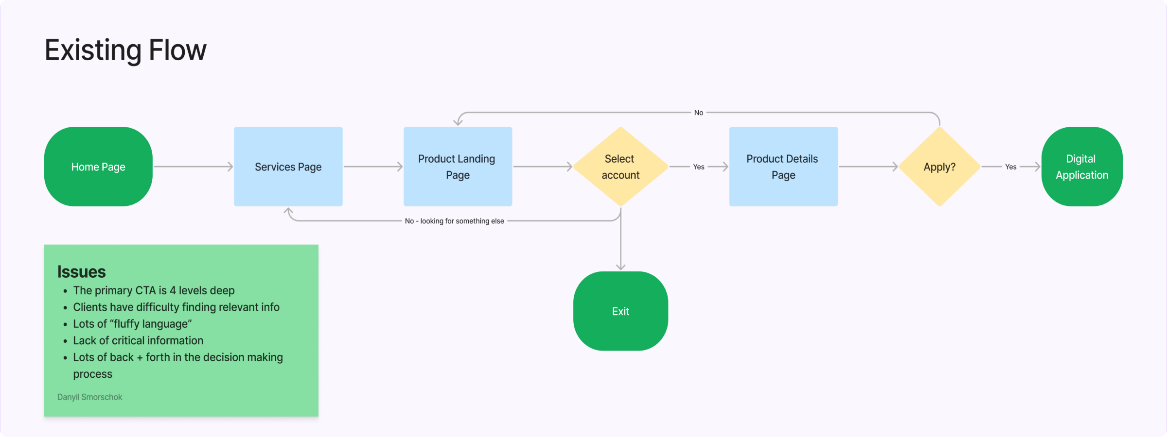
Creating user flows helped me understand the user journey better. This allowed me to identify shortfalls in the current state, such as hard to find CTAs.

Optimizing the CMS expeprience

Since this tool was going to be a CMS component, I collaborated with developers and the PO to refine the content manager experience when implementing this tool on atb.com.

Prototyping and testing

High fidelity mockups and prototypes helped us test the newly proposed designs. As a result, the designs went through multiple iterations before an optimized layout was agreed upon and handed off to developers.
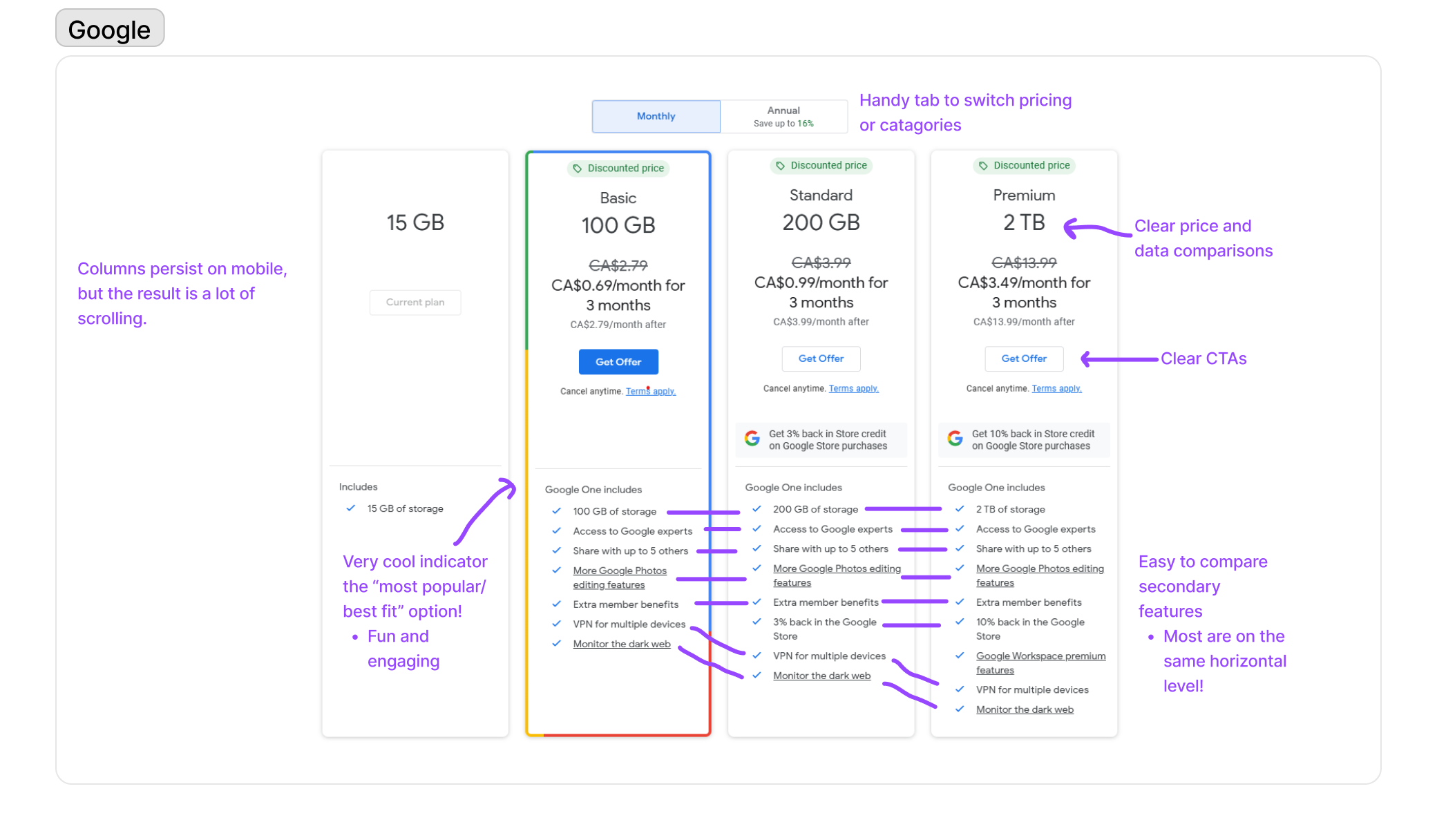
A screenshot of Google's comparison tool. Some takeaways included:
- Useful tab to switch between account types or pricing structures,
- When attributes line up horizontally it's much easier to compare features,
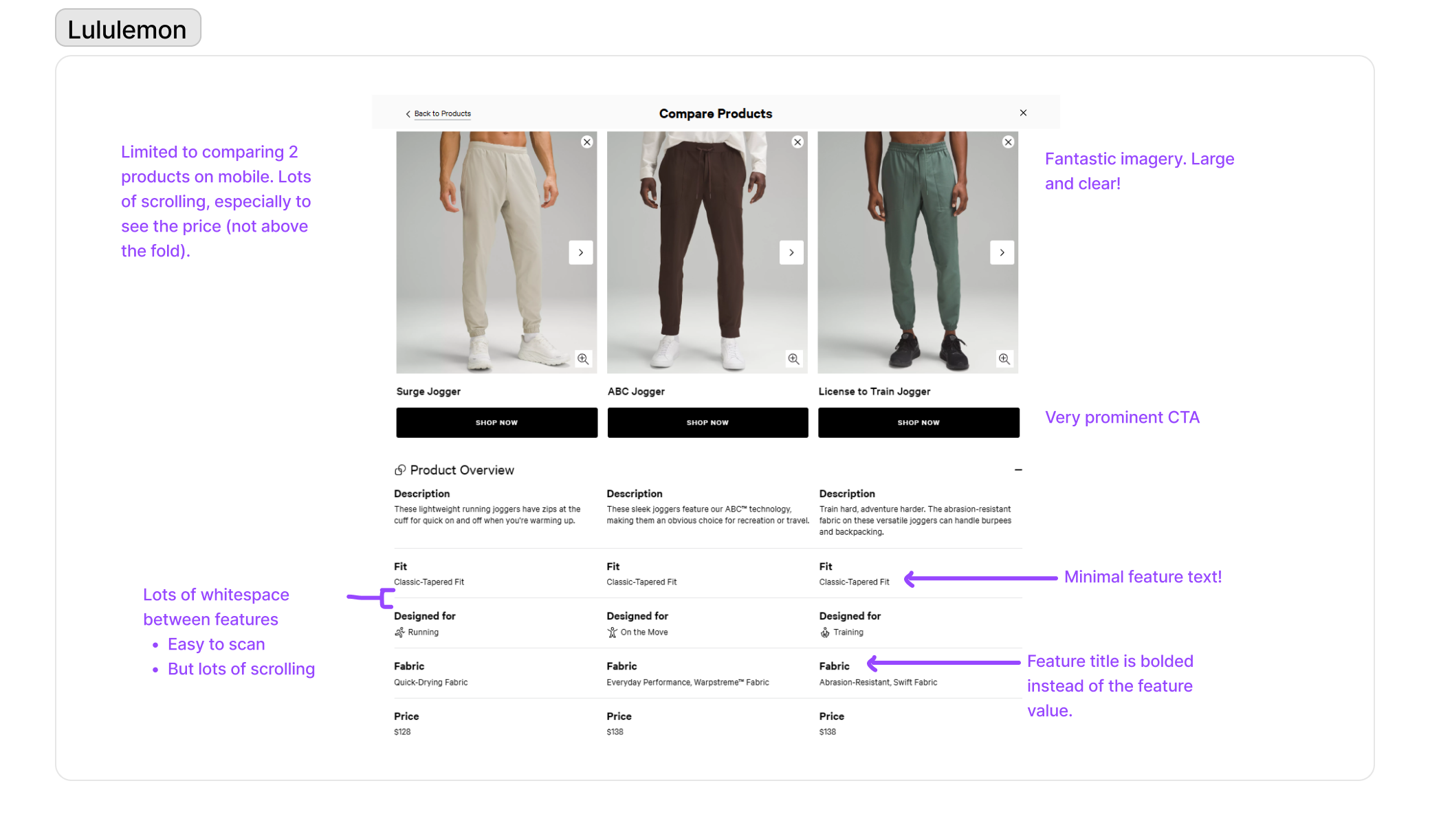
- Clear CTAs live above the fold.A screenshot of Lululemon's comparison tool. Some takeaways included:
- Lots of white space gives a clean design but results in a lot of scrolling
- Minimal text cuts down on how overwhelming the tool is
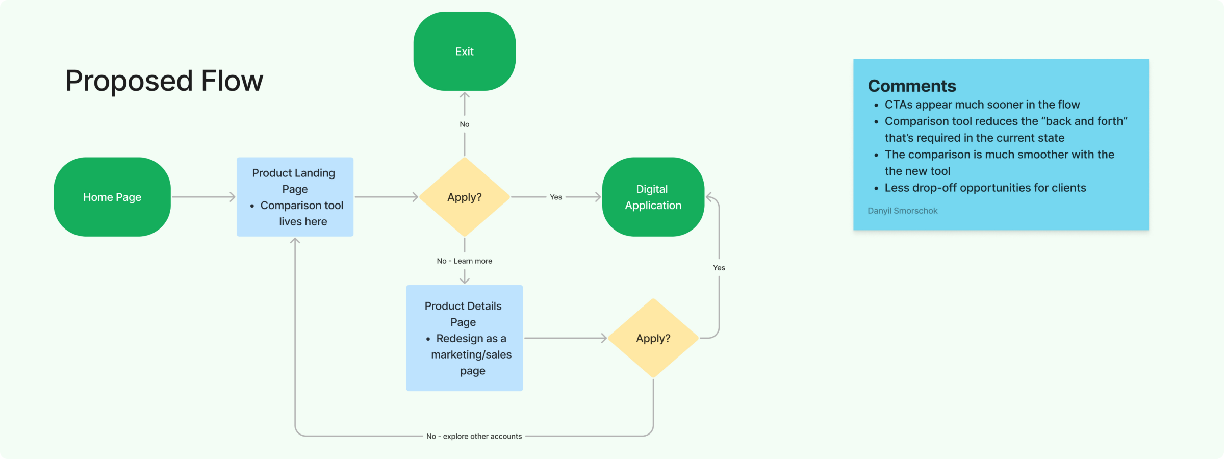
- Very prominent CTAs.A user flow outlining the existing digital account opening experience. 

Users would start at the home page, navigate to a service page, then navigate to a product landing page and then face a choice about which account to view. They could either exit the flow here or continue to the account's details page, and here is where they would see a call to action to start the application.An image of the proposed digital account opening flow. 
The users would start at the home page, navigate to the Product Landing page where they would use a comparison tool to view accounts. The comparison tool would house two calls to action - an Apply Now CTA and a Learn more CTA. If the client chooses apply now, they would start the application while Learn more would take then to a product details page (with another open now CTA).
Design decisions
Drawing inspiration from the above examples, my team and I prioritized the following features for the comparison tool:
  • Category tabs, which would limit clients to comparing similar accounts only. This would reduce cognitive load and the risk of overwhelming clients.
  • A callout of the 3 most important account features, which would significantly aid in client decision making.
  • Clear calls to action that would live near the top of the tool.
  • A "most popular" tag which would assist with decision making.
Below you can see a few of the iterations this tool had gone through.
The final version
My team and I ran a couple of rounds of usability testing to validate the above designs. Based on the findings, we implemented the following changes:
  • Increased padding to improve white space. This made the overall design feel less crowded and improved readability
  • Implemented horizontal swiping on mobile devices. Clients significantly preferred horizontal swiping when compared to scrolling.
  • Redesigned the "most popular" tag so that it would be more prominent and attention grabbing.
Lessons and achievements
A significant lesson I learned from this project was the value of iteration and the importance of maintaining a fluid mindset, even after initial design success. Continually seeking improvements and questioning my own ideas led to the creation of a truly exceptional experience.

Moreover, this project emphasized the critical role of user research. Although the initial designs received positive feedback from the design team, it was through user testing that inefficiencies and shortcomings were identified. By actively listening to our clients, the team was able to develop a remarkable, accessible, and highly useful experience.
Digital Onboarding Redesign
UX Process | Strategy | Business Alignment | Work Project
View project
Designing Financial Calculators
Strategy | Product Design | Journey Mapping | Work Project
View project